Wednesday 31 August 2016
Rowan Knitting & Crochet Magazine 60: A Review
Rowan has released issue 60 of its knitting and crochet magazine. Let's have a look at it!
Ember. This is a Kaffe Fassett design -- and it's available for free from the Rowan website. I rather like this vest, but I am finding the styling choices made here to be rather inexplicable.
Tabert. This design is very "overwhelmed stay-at-home and homeschooling mother of six".
Reiver. I'm really loving the unusual and striking embroidery motifs, but I'd nix the blanket stitched edges and go with a more polished edging.
Braveheart. This scarf is some seriously innovative argyle design. I wish I could get a better look at that sweater.
Barley. Classic cabled sweater and hat with some good shaping.
Balfour. I'm loving the intricate fair isle stripes.
Glen. Some great colourwork here, and I love the cardigan, but I'm not crazy about the shaping of the vest.
Brodie. This one's fun and playful in an adult way. I'd neaten up the shaping of the sweater. The hat is good as is.
Hartwist. The pattern is beautiful, but I would neaten up the fit. Very much liking the scarf with its dots of contrast colour.
Numbus. The colourwork is interesting and evokes the 1940s. I wish I could see the neckline.
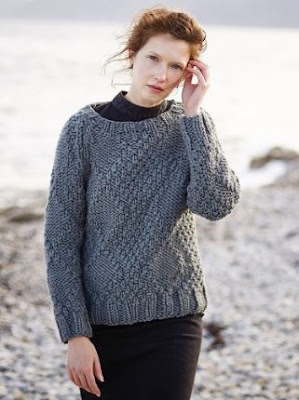
Barista. Warm and comfy with some interesting stitchwork.
Cupcake. A classic cabled cardigan that didn't get the buttons it deserved.
Echo. Very much liking the ruched cables on this sweater, which is almost more of a fabric-like effect than one common to knitwear. The shaping is very good as well.
Caliban. I can't properly evaluate this poncho because I can't see it well enough in this photo. All I can say is that it appears to drape well.
Pretzel. This doesn't look too bad when worn belted by a professional model, but I have a feeling it would take a turn for the frumpy when worn open by a civilian.
Havana. This one looks divinely comfortable and I love the loose cable devices. I'd raise the dropped shoulders and neaten up the fit a little -- but only a little, because this is a piece that calls for a relaxed fit.
Reya. Some really lovely two-tone fair isle work in this one.
Granola. Some simple yet effective stitchwork.
Torte. So frumpy, and those short sleeves look ludicrous.
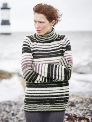
Lorenzo. I like the overall stripe pattern, but would make a few tweaks. The stripes in the cuffs, neckline, and waistband don't quite work with the stripes in the body, and I would also nix that lavender and put in another colour with more oomph and contrast.
Rainey. Nice piece with a beautiful yoke.
Teacake. How perfect is the Rowan's Kidsilk Haze version of this one (inset)? It's nice in the bulkier version as well, but I would go with a more interesting colour.
Brew. Not bad. It's quite wearable at any rate. It could use a more interesting colour.
Nyla. This one has a strikingly graphic appeal.
Mara. This colourwork of this piece is incredibly innovative and cool, but the shaping is terribly unflattering. I'd take the chart and apply it to another piece entirely.
Cookie. I love the all-over leaf bobbles in this one, and the back looks good. I can't see what's going on the front and so have some reservations about it.
Biscotti. A handsome scarf.
Ariel. This is... okay. It's a bit different, and it's wearable, but somehow it isn't quite grabbing me. Perhaps it's the choppy effect of those sections on the sleeves.
Prospero. An okay cowl. It's hard to say more based on this photo because I can't see the detailing.
Umbra. This is rather an elegant coat, though I'd still prefer it to be more shaped.
Shadow Hat & Scarf. I'm liking the beanie version (inset) of the hat rather than the slouchy version, because the edges of the latter look unfinished.
Thorn. The intarsia pattern is excellent and the contrast bands really set the design off.
Thursday 25 August 2016
Vogue Knitting Fall 2016: A Review
Vogue Knitting has released their Fall 2016 preview photos. Let's have a look at them, shall we?
Pattern #1. Classic fair isle pattern, and this cape sits and drapes very well.
Pattern #2. Very smart take on the classic fair isle yoke sweater. I'd totally wear this myself.
Pattern #3. I like the fair isle pattern, and I know one must knit fair isle scarves in a tube so as not to have a wrong side, but finishing this scarf off with ribbed cuffs makes it look like the wearer tied a couple of extra sleeves around her neck.
Pattern #4. I like the fair isle pattern and the mitts, but the neck and sleeve shaping of this vest looks dowdy to me.
Pattern #5. Nice piece. I like the modern feeling combination of a fair isle front with a tartan back.
Pattern #6. Beautiful design, and the colour palette is fantastic.
Pattern #7. A very handsome cowl.
Pattern #8. Very pretty. I love the subtle shades of blue combined with that very pale pink.
Pattern #9. That's a pretty fabulous cushion.
Pattern #10. That middle section looks like a mistake. I think the problem was that it needed a more definite divider from the rest of the vest than a single hacky-looking garter stitch row.
Pattern #11. A polished, contemporary piece. I'd love to see this one done in colour blocks.
Pattern #12. Nice. A subtle but interesting pattern that will look well with many outfits and coats.
Pattern #13. I wasn't sure how I felt about the back slit at first, but I think it works. Given that the edges are well finished and the rest of the sweater is well-shaped and has good stitchwork, the overall look is that of a modern, feminine version of the tail coat, which is a great design direction, especially considering that one of the alternative paths is "mud flaps".
Pattern #14. Classic cabled sweater, updated with a sectional look.
Pattern #15. Beautiful stitchwork in this.
Pattern #16. Oooh, lovely. So flattering and polished.
Pattern #17. This one is very boxy and will be hard for most women to carry off.
Pattern #18. This one could have used a more finished-looking neckline to go with the sleeve cuffs and hem.
Pattern #19. Not bad, but I would raise those dropped shoulders.
Pattern #20. Very Gap-ish.
Pattern #21. Classic man's pullover.
Pattern #22. Some great texture in this one.
Pattern #23. Classic hat, though I don't know how many men would want that pom pom on there.
Subscribe to:
Posts (Atom)


